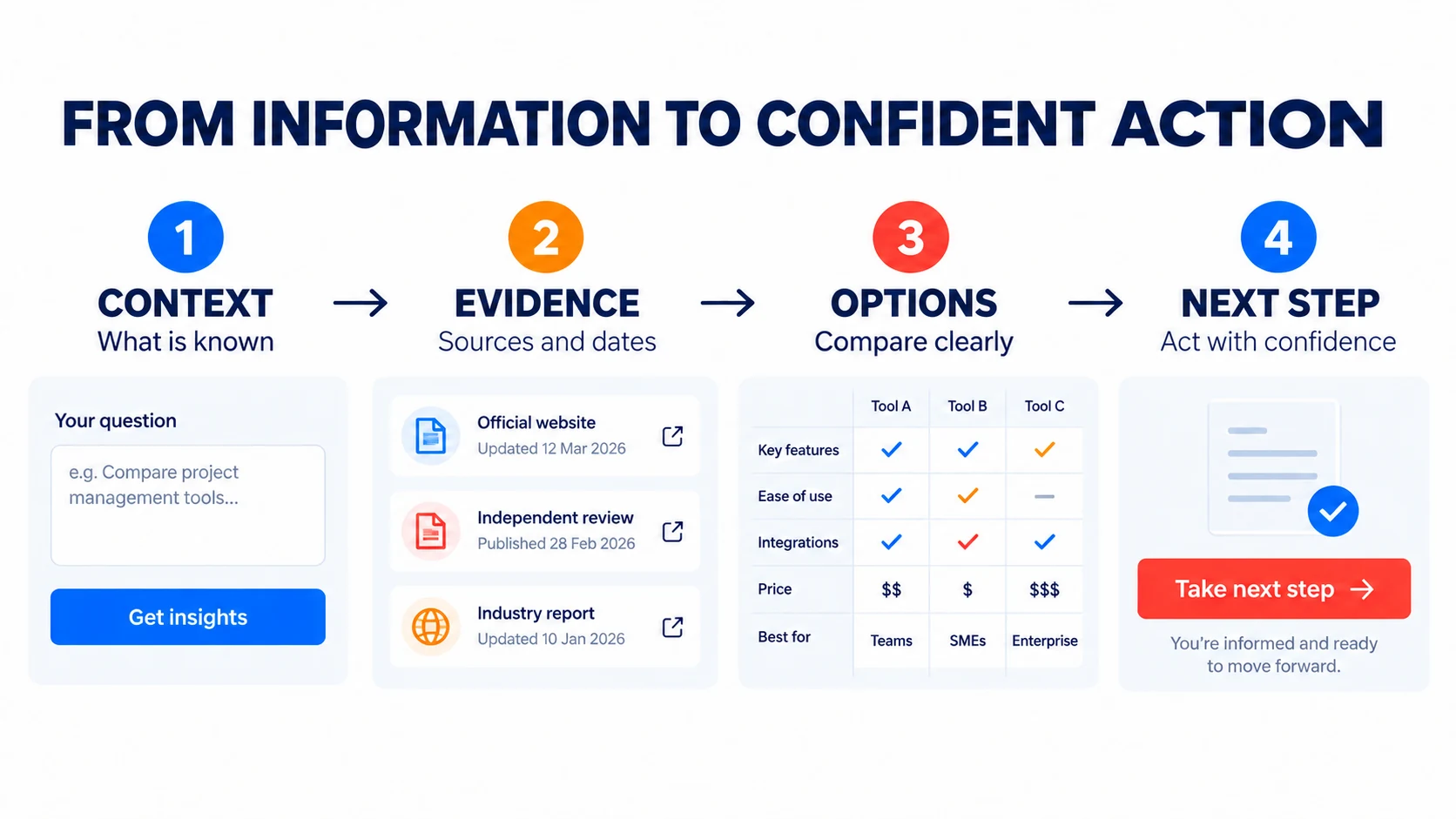
A calculator, assessment or dashboard can turn a website from a place people read into a place where they can make progress. The value does not come from animation or novelty. It comes from helping someone understand a situation, compare realistic options and choose a sensible next step.
That responsibility matters. A polished interface can make a weak estimate feel authoritative. A useful digital decision tool does the opposite: it makes context, evidence and limitations visible so the user can judge the result properly.
Start with the decision, not the feature
Before designing controls or charts, define the decision the tool should support. A budget estimator might help a team decide whether a project is ready for discovery. A website assessment might identify the area worth reviewing first. A comparison tool might help someone understand the trade-offs between several approaches.
Write the purpose as a short outcome: “After using this tool, the visitor can…” If the sentence describes collecting leads, showcasing technology or keeping people on the page, the user value is still missing.
Ask only for information that changes the result
Every question adds effort and introduces another point where someone can leave. Ask for an input only when it materially changes the recommendation, range or explanation. Put related controls together, use visible labels and explain unfamiliar terms close to the field.
The W3C Web Content Accessibility Guidelines require labels or instructions when content needs user input. That is a useful baseline for every visitor, not only an accessibility requirement. People should know what to enter, which format to use and why the information matters.
- Use familiar units and sensible default values.
- Show examples when an input could be interpreted in several ways.
- Do not require contact details before providing the promised result.
- Make keyboard, touch and screen-reader interaction part of the component design.
Make the calculation understandable
A result becomes more trustworthy when the user can see how it was formed. Name the important assumptions, identify the source and date of external data, and distinguish a measured fact from a modelled estimate. If changing one input has a large effect, make that relationship easy to explore.
For an indicative budget, show a range and explain what pushes the scope towards either end. For an opportunity assessment, describe why an answer affected the priority. For a forecasting tool, let people compare scenarios without presenting the most optimistic case as a prediction.
Design the result as an explanation
A large score or chart is not enough. The result should answer four questions in a sensible order:
- What does this mean? Summarize the result in plain language.
- Why did I receive it? Connect the result to the inputs and evidence.
- What could change it? Explain assumptions, uncertainty and important omissions.
- What can I do next? Offer one useful action that fits the result.
The next step does not always need to be an enquiry. It may be saving a checklist, reading a related guide or adjusting the scenario. A commercial action feels more credible when it follows useful guidance rather than replacing it.
Show feedback without disrupting the task
Interactive tools often update totals, recommendations or validation messages without loading a new page. These changes should be visible and programmatically understandable. WCAG guidance on status messages explains how assistive technology can announce important results or errors without moving keyboard focus away from the user’s current task.
Use feedback selectively. Announcing every small change can become distracting. Confirm meaningful events such as a completed calculation, a changed recommendation or an input that must be corrected.
Treat privacy as a product decision
A useful tool does not automatically require an account or customer database. Many calculations can run entirely in the browser, and temporary state can remain on the user’s device. If an email address is optional, say so. If results will be stored or sent to a team, explain that before collection.
Client-side processing is not a promise of complete privacy by itself. Analytics, embedded services and browser storage still need review. The principle is simpler: collect the minimum information needed to deliver what the interface promises.
Use ranges when certainty would be misleading
Business decisions depend on variables a short tool cannot fully know. Content readiness, integrations, approval speed and technical complexity can all affect a website estimate. Competition, authority and implementation quality affect an SEO opportunity. A responsible model acknowledges those conditions.
Showing a range is not weakness. It helps the user understand which decisions matter. Add a concise explanation of what is included, what is excluded and when a professional review is needed.
Build for small screens and interrupted attention
GOV.UK service guidance recommends making services simple, intuitive and comprehensible across the devices people use. For an interactive tool, that means more than stacking desktop cards into one column. Controls need comfortable touch targets, charts need readable alternatives and progress must remain clear when the user cannot see the whole interface at once.
Preserve answers when someone moves between steps. Avoid unexpected resets. If the tool takes more than a minute, show progress and let the user review earlier choices before finishing.
Test comprehension, not only completion
A technically successful session can still produce the wrong understanding. During usability testing, ask people to explain the result in their own words. Check whether they know which information was factual, which was estimated and what they would do next.
Review real behavior after launch, but do not optimize only for completions. Useful measures can include completion rate, correction rate, scenario changes, related-content visits and the quality of enquiries that follow. Pair analytics with feedback so the team learns why people hesitate or misinterpret the result.
A practical decision-tool checklist
- One clear decision or customer task
- Only inputs that materially affect the result
- Visible labels, units, examples and validation
- Sources, dates and assumptions beside the result
- Ranges or scenarios where an exact answer would mislead
- Accessible feedback for dynamic changes
- A mobile journey designed for touch and limited space
- Minimal data collection with a clear explanation
- A useful next step matched to the result
- Testing that confirms understanding, not just completion
Good interactive tools make complexity easier to navigate without hiding it. They show enough of the reasoning for people to trust the process, understand the limitations and act with greater confidence.
Explore the idea in practice
See how these principles connect to UI/UX design, web development and digital strategy. You can also use the BrandDigital Project Planner to explore an appropriate project scope, or review the MarketMaster.com case study for an evidence-led example of connected research and decision tools.
Sources and further guidance
- W3C Web Content Accessibility Guidelines (WCAG) 2.2
- W3C guidance on labels and instructions
- W3C guidance on status messages
- GOV.UK Service Standard: make the service simple to use
Frequently asked questions
What makes an interactive digital tool genuinely useful?
A useful tool starts with a clear user decision, explains the inputs it needs, shows where information comes from, makes assumptions visible and gives a proportionate next step. It should improve understanding rather than create false certainty.
Should a calculator present one exact answer?
Only when the underlying data genuinely supports an exact answer. Estimates should usually show a range, identify the main assumptions and explain which factors could change the result.
Do interactive tools need to collect personal data?
No. Many assessments, calculators and comparison tools can work entirely in the browser. Collect information only when it is necessary for the promised service, and explain clearly what will happen to it.